Pages

About Me

My photo
Hello my name is Shelley Newman i am an artist based in London and i am currently studying a Foundation art degree. I have always been interested in art & design since i was little, my hobby is drawing Manga, a Japanese cartoon drawing style witch is very popular around the world. My artwork is based on graphic design where i use photoshop to manipulate my artwork, On this blog will be my personal artwork and also my work from my course, I hope you enjoy.

Sunday, 10 February 2013

10x10 Project - Balham triangle.


This was my final outcome for the 10x10 project where we were given a numbered square of a map of Blaham. We had to go to our chosen site and collect an take images to later respond to them. We visited the Somerset house where they were holding a similar thing where we got the idea from. (Somerset House)
Mine was inspired by an artist i saw at the exhibition called  Joseph Robson and that's who i responded too.

Ceramic coil pot

This was the first coil pot I had ever made and i surprised myself because it came out pretty good. I found this technique in making clay pots easier then my usual way which is by the wheel because its less messy and less complicated also if you mess up along the way its easy to fix. Rather then on the wheel if you made a mistake its more hard to fix because of all the water you have to use to get the shape right. So this technique of making pots it now the one i will use next time and when i want to make other types of ceramic items.


The next step was the let the pot completely dry out so it could be fired then we had to used our research of our chosen historical site, mine was on the Balham bombings in the 1940's. (See my post on the Balham bombings). I drew on the pot the remembrance plaque, the tube station today and some other images of the devastating bombings. Unfortunately after firing this pot the drawings all came off because we did not put on another glaze before firing it, witch is a shame because i was really pleased with this but these things happen and we can only learn from them. Next time i will have to make sure weather or not the pot needs another layer of glazing before the final firing.

Sunday, 6 January 2013

Portrait Paintings

We spent a whole day painting these portraits of ourselves, we started by taking the photos professionally in the dark room using lights to create contrast and a mood to the pictures. Once the were printed we started off by mapping out the light and dark areas of the picture and then started to paint firstly in black and white as a under layer to the painting. Then after we had finished painting in black and white we started to add colour to our portraits, below is an image of mine we also had to use our chosen objects in our portraits the reason behind mine is that I often don't like the way I look and because my object was a little mirror given to me by my nan, in my portrait I am looking away from the camera and the mirror indicating that I don't want to look into the mirror.

10X10 Gallery Visit - Somerset House

We went to the Somerset house exhibition unexpectedly one morning, I'm glad we went though because there were some interesting works their that inspired me for my own 10 x 10 project for Balham. I based my work on Joseph Robson and his piece The old war office, and interesting building to draw but her took this building and used multi media witch I love to use because I like using a range of materials in my work. He divided the building into sections and then he used a mixture of pencil, watercolour and different types of photography with different effects, All together I think this piece us really visually interesting to view.


Site specific art - Analysis of a site

 In this session we were given the task to take our chosen objects and place them in certain situations or place but there had to be a meaning to why we had pout our objects there, this session was to teach us about Site specific art.

Site specific art is when artists place their artwork somewhere where there is a meaning and where the right audience for their art can be viewed. The place the art is put might even be part of the artwork itself adding to the whole feeling to the piece.

My chosen object was my nan's mirror, the mirror is very old looking and so I wanted to place it somewhere that looks old or somewhere unusual, to be honest at first I did not know why I was placing the mirror in these places but I got some interesting photos none the less.

Christo & Jeanne-Claude:

 These pieces I find fascinating because of the scale of the artwork;  I would not be able to produce something like this but maybe one day, but not right now I will stick to my small scale projects until I'm ready and have the funds to create something on this scale, but still the places they site their art makes a big difference because if they had just used outside their front door on a random road it would give the art a completely different feel to it.


 Our next task was to write a word or sentence on a bit of paper and we had to go around Balham and place the word in different places. For some reason I chose to place my word 'LOL' meaning Laugh out loud in situations witch are not funny but now are slightly amusing because of the word LOL being placed their.


I thought this idea was amusing so I went with it.


Banksy:

Banksy put up four pieces in London, One on the side of National Gallery, one in Bell Lane near Liverpool St. Station, one on Wapping High Street – all which were removed very quickly.
This is presented on a billboard next to canary wolf; where the nations money is generated and the fact that it is on a manky billboard on a deserted street makes you think about where that money is going and is it going to the right people. The fact is when you read the writing "Sorry! The lifestyle you ordered is currently out of stock" sounds like a recorded message that you would get at a bank or over a tanoy.
6300885541 565edec643 b1 40 Inspirational Examples of Banksy Art and GraffitiThis is another by Banksy; where a little girl is holding out her hand as if she is asking for money or something maybe even food. and there is no rain outside of the umbrella but only on the inside of the umbrella witch makes you think why is it only raining on her?.


The Fourth Plinth:

The Fourth plinth is situated in the north west corner of Trafalgar square; The plinth was originally designed by Sir Charles Barry in 1841 to display an equestrian statue however due to insufficient funds the statue was never completed. Following the sucess oh comissioned artwork over 150 years later by Mark Wallinger, Bill Woodrow and Rachel Whiteread that were displayed on the Fourth Plinth.
Now the Mayor of London has begun The Fourth Plinth programme where artists can exsibit thier work.


Friday, 4 January 2013

Urban Landscapes - London

The shard building was the best thing I saw that day; I enjoyed drawing it because of the size and scale of the building and also because of the worms eye view I had.

We walked along the River Thames from London Bridge station where we all met.
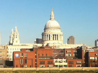


We went up the OXO tower near London Bridge and we got an amazing view from up there.
It was interesting to see the view of all the different buildings and towers in London. It was a pretty good view from there because we could draw the river with the bridges and the skyline behind.
I liked drawing the boats on the river with the green trees behind then with the blue skyline, there are lots of layers to draw.

I focused one of my drawings on this church because i thought it looked interesting poking out from the trees.


Walking along the River I saw this old structure of planks of wood thought it looked good in the contrast to the river and the trees behind.


The mess on the rivers beach.

The disgusting box filled with fags and water from the rain.


While walking around London I found I was drawn to patterns mostly.
Also I was drawn to taking pictures of the floor and cracks in the pavement in the streets.


Found objects.


Reminded me of pathways.


The way the leaves fell I thought looked cool across the concrete slabs.
These trees against the blue and white sky brought out all the individual branches.
While walking along I looked up and saw this black light and I liked the shape and reminded me of old Victorian style streets.
I love these kinds of roads, old cobbles I think they look better then the tar mac we have today on all our roads, more interesting to look at.


I really liked this space in the wall, the pattern is interesting.

Some other weird pattern I found on a wall.

While walking along we all saw this on the floor on a main road, found it quite funny.